Like I have said before, the flow of my house is extremely important. I hate walking into houses, and the paint colors in certain rooms just slap you in the face. I want my house to be bright, colorful, and creative, without being offensive. I settled on the color scheme I am about to share a couple of weeks ago, but I keep second guessing myself, as it is a little cooler and more neutral than I think I want. However, the husband loves it, and I am learning more and more that this kind of neutral can be a very good thing because it is still interesting. Also, I was thinking that if my house was mostly neutral with colorful accessories, I can customize each room for seasons and parties, which is oh-so-important!!! haha! Another perk of the colors I chose for the walls and the accessories are very cohesive and the accessory colors can be mixed and matched in any room and still look great! How's that for flow and function!?
And now I present....THE COLORS!!! (the pictures I took were way off, so I found these color swatches online. They do not seem perfectly accurate either, but you'll get the point.)
 | |
| Valspar's Jekyll Grand Dining Sea Mist. My swatch seems lighter than this version. This color will be in the living room. If you remember from the previous post, the living room has a stone fireplace and a wood ceiling. I'm thinking a creamy/mustard yellow and an off white for the accents in this room. |
 | |
| Olympic's Classic Khaki. this color will be for the entry, halls, master bedroom and bath, hall bathroom, and most of the basement bedrooms. It is a soft khaki...your typical neutral paint color. It's similar to what we have in our current house, and it works with the decor that we already have. I wanted to go with a gray color, but 1. I'm a chicken, and 2. We can't redecorate every room in our house. Yes, our bedrooms will probably look exactly the same in the next house:) |
 | ||
| Valspar's Granite Dust. All these colors look so dark!!! This color is much much lighter and will be in the formal dining room:) Wes is talking about adding wainscoting! How exciting!!! |
 |
| Valspar's Stone Manor. I was afraid to go this dark in any room because my goal is light and airy. However, this is for the kitchen and laundry room where there are huge windows, white cabinets, and lots of light things to break up the space! |
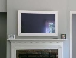
These colors, on my computer are much darker than they look on my swatches. I hope they look better in the rooms. Here is an example of a room with the granite dust paint in it...
As far as accessory colors go, I'd like to incorporate orange, green, yellow and teal. I'd also like to have several elements of glass, silver metals, nature-y things, and white ceramics in the house....


mmmmm...Isn't it lovely!!
Can't wait to get my hands dirty!!!!
:)
No comments:
Post a Comment